Illustration | Brand | Campaign | Charity
Brand illustrations for ShowerBox
ShowerBox is a charity that provides free, safe shower facilities for people experiencing homelessness. Warm, human communication is central to what they do, but imagery presented a real problem. Stock photography wasn’t appropriate, and photographing real service users raised questions about dignity, consent, and safeguarding. They came to me knowing illustration was the answer — the job was working out what kind.
I suggested a textured line drawing style, layered with bold blocks of ShowerBox’s brand colours. The style was refined gradually, lowering the number of colours as we went until it felt distinctive without being busy. The timing added an extra layer of complexity: ShowerBox were mid-way through a website redevelopment and had recently updated their logo, so everything was in flux at once. The illustration style, the brand, and the new site all had to come together at the same time.
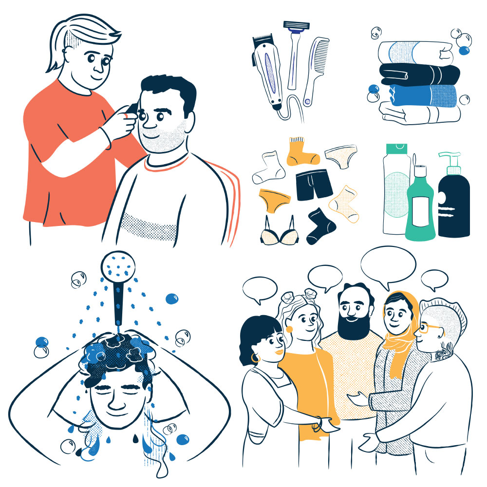
From that foundation I created a suite of assets: a hero graphic for the homepage, 11 portraits representing the diversity of people who use and support ShowerBox, eight key objects central to their service, and illustrated maps of their three locations.
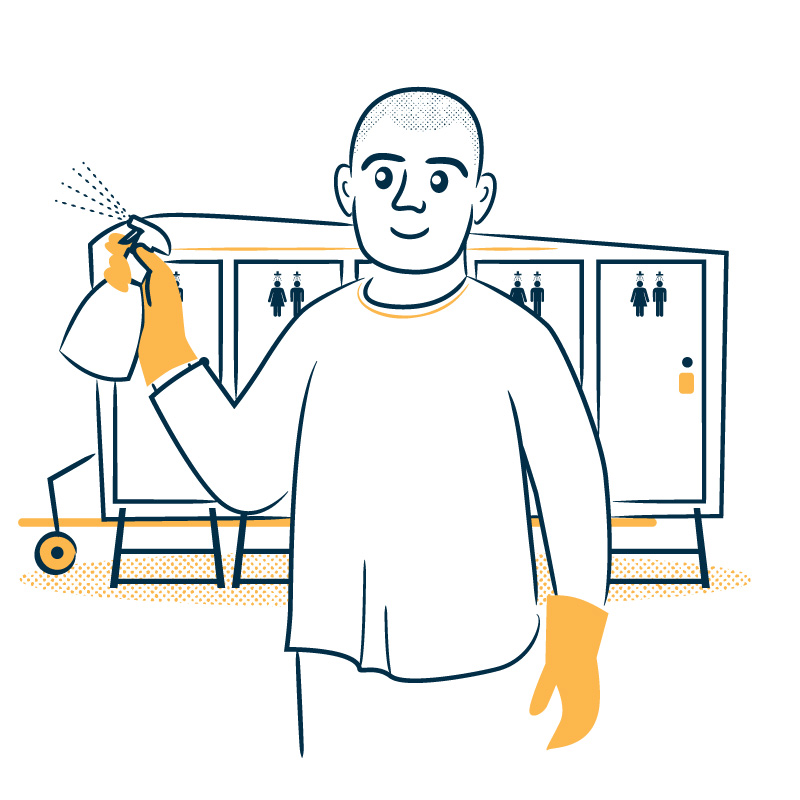
ShowerBox have since returned for a volunteer handbook, requiring a second set of illustrations to accompany guidance on de-escalation, when to call the police, and other situations volunteers might face. A set of icons in the same style completed the suite.
The portraits are where the brief required the most care. Getting a range of people to feel genuine rather than assembled is less about process and more about habit, keeping your eyes open, noticing people, and remembering details. Not drawing the same people over and over. Occasionally, a haircut, a pose, or an expression from someone I’ve met finds its way in.


Previous project
Next project
Let’s work together.
If you’ve got a project that needs clear, human-centred design, illustration, branding or a combo of all three, I’d love to work with you.