Design and Illustration Work
Projects, case studies, and the thinking behind them
Brand | Campaign | Illustration | Charity | Fundraising
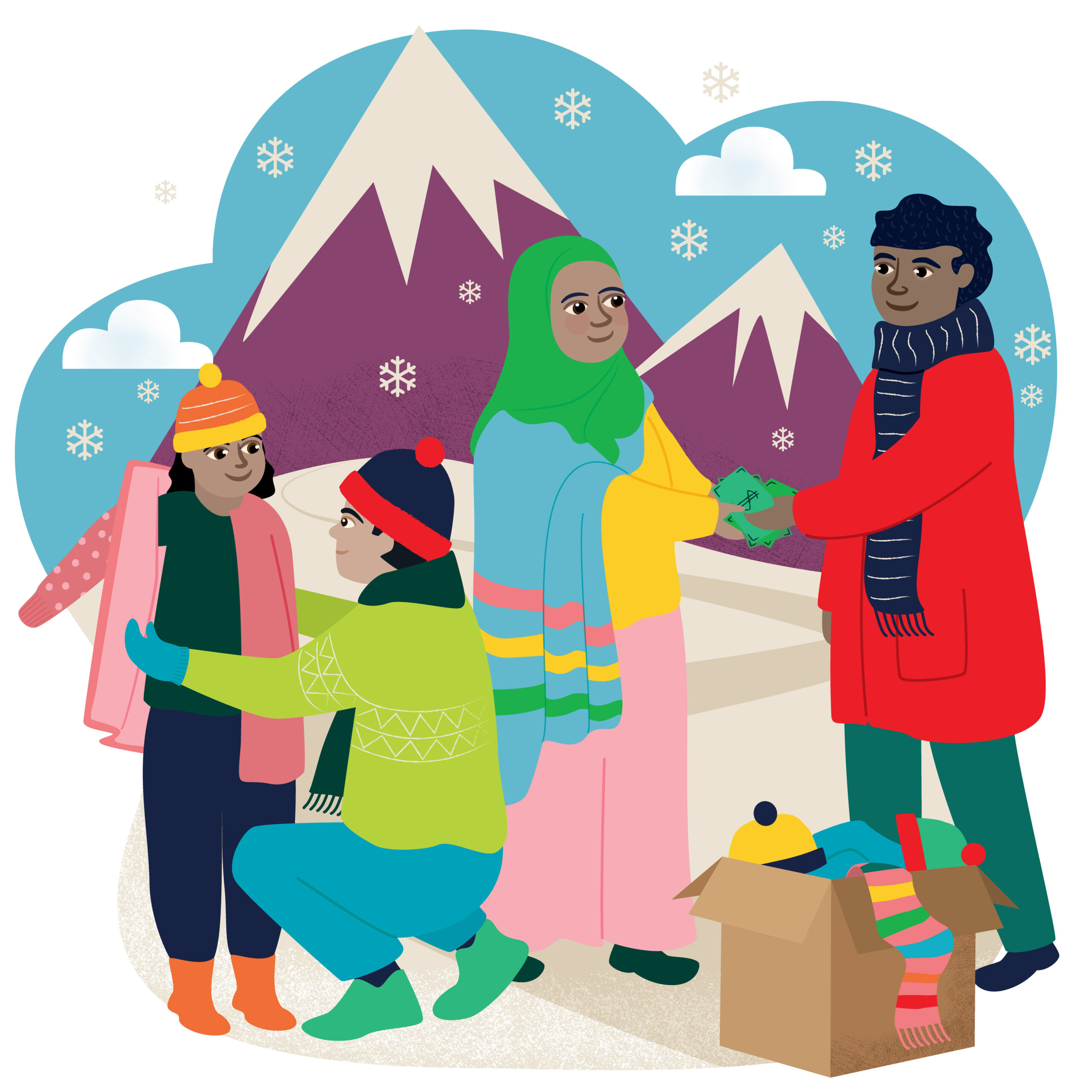
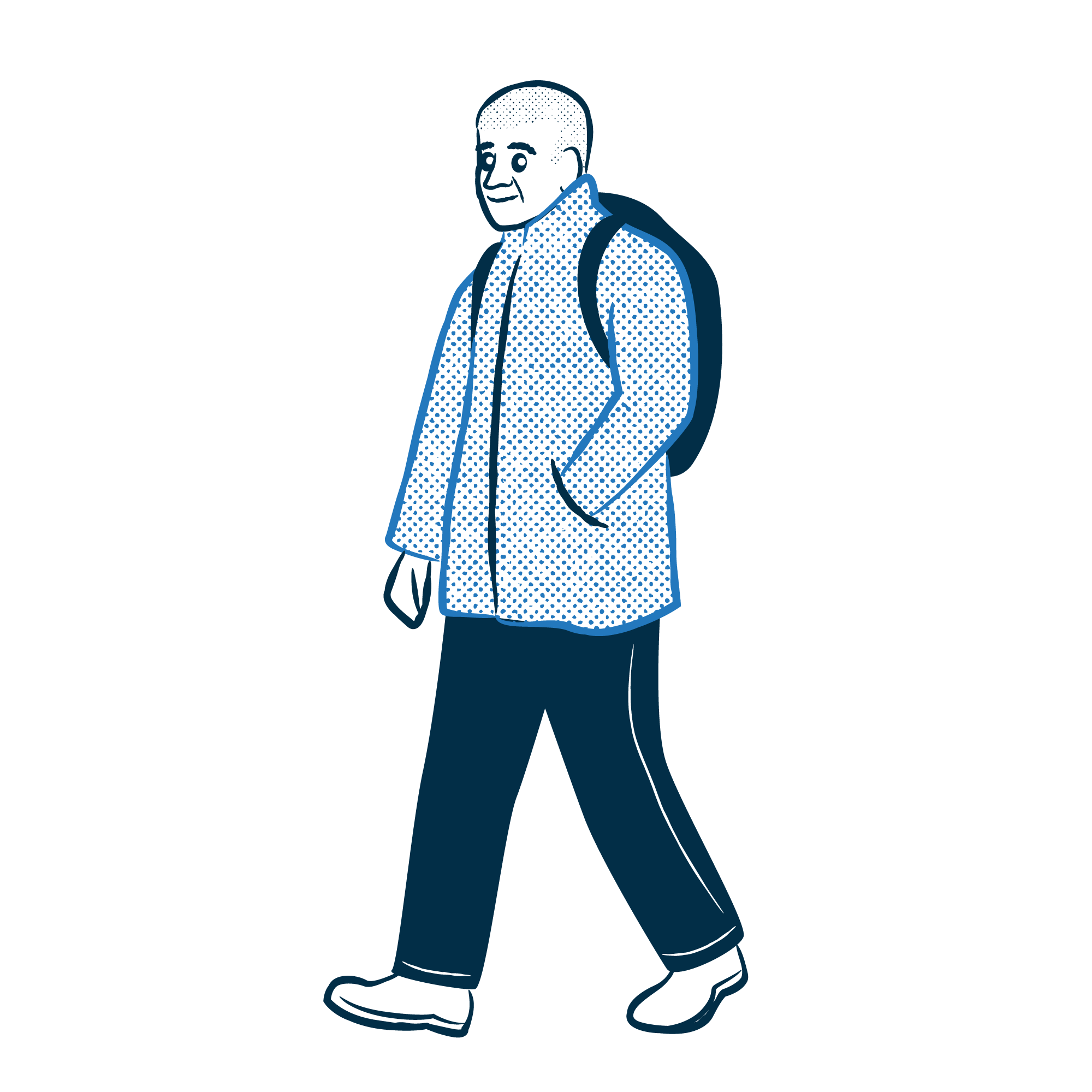
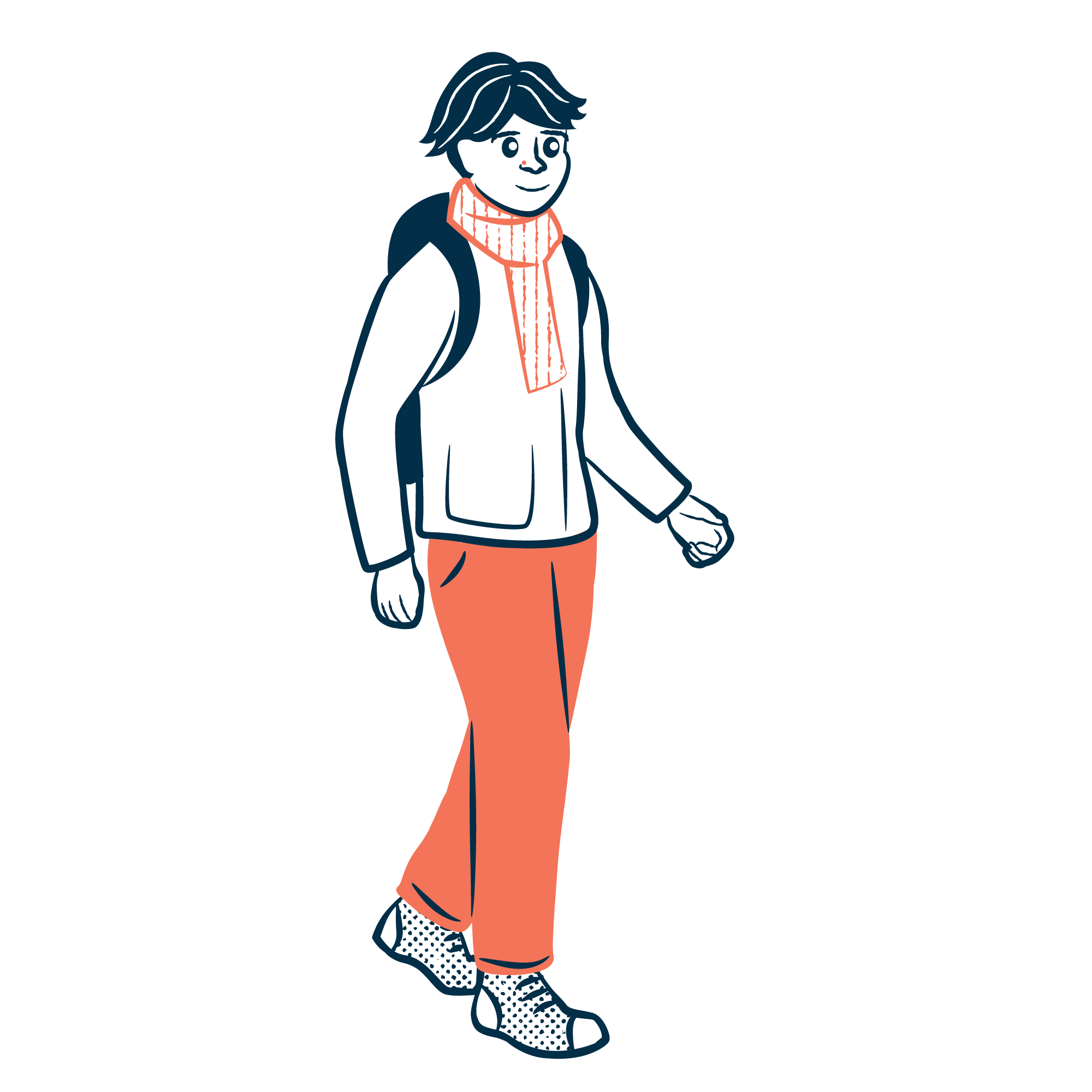
CAFOD World Gifts Charity Illustrations
CAFOD’s World Gifts, a range of virtual charity gifts letting supporters buy everything from a goat to clean water, had outgrown its illustration style. With a refreshed brand and ambitions to reach a broader audience, they needed visuals that could compete with the bigger names in charity gifting.
Working closely with the CAFOD team, I took each gift and brought it to life with a fresh, cohesive illustration style – warm, human, and built around uplifting storytelling. Over 80 illustrations in total, giving the whole range a consistent personality that felt true to CAFOD’s values and inviting to supporters.
The Christmas following the relaunch was a record-breaking year for the range. We’ve worked together every year since, expanding the library, creating cards and nativity items, and developing merchandise including bags and coasters.


Brand | Illustration | Climate | Large Format | Environmental Consultancy
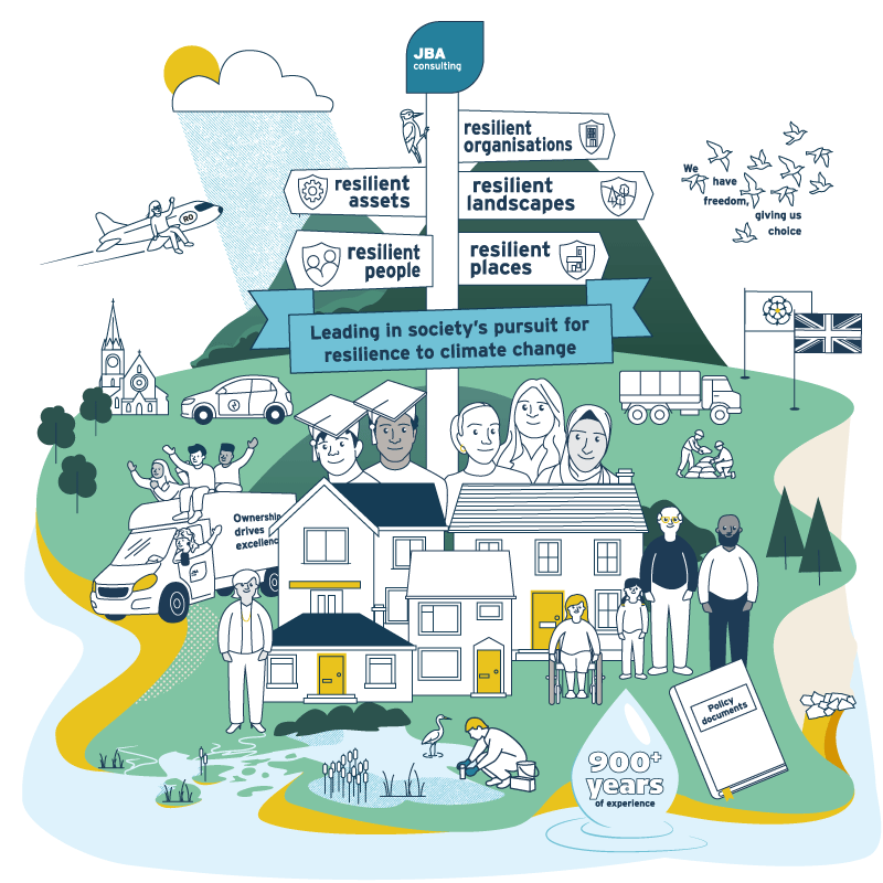
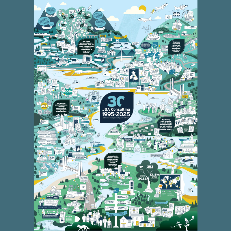
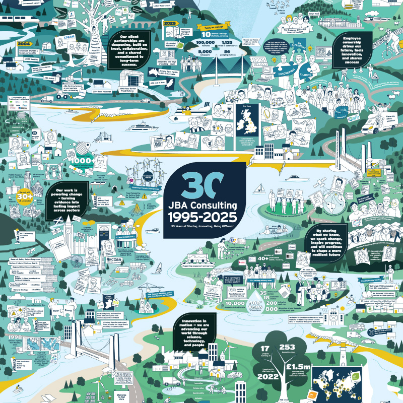
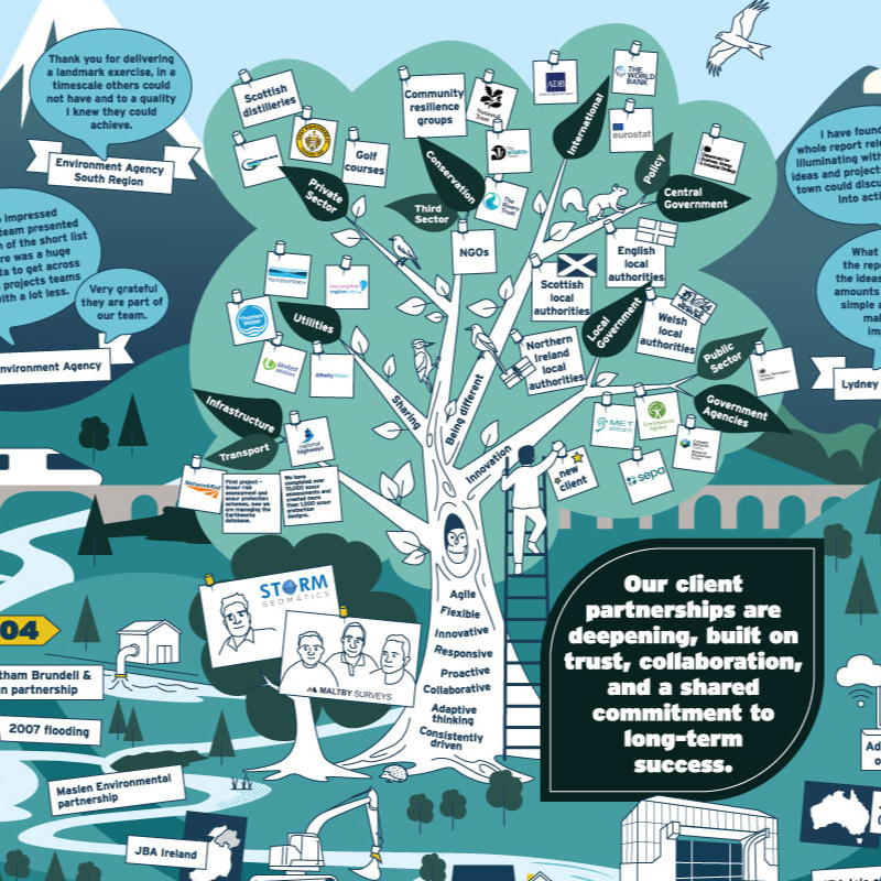
JBA 30 Year Anniversary Illustration
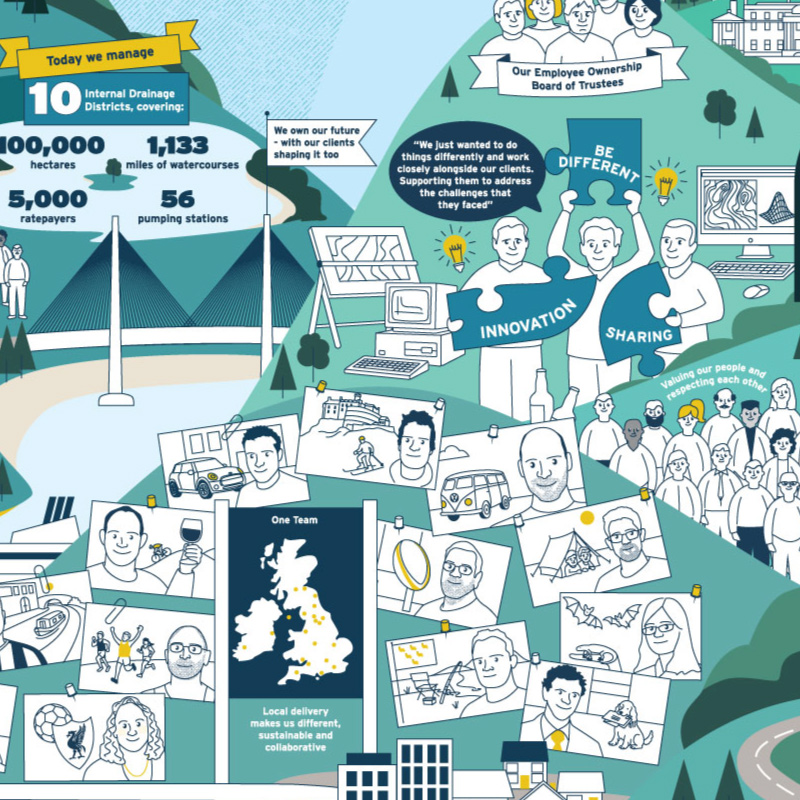
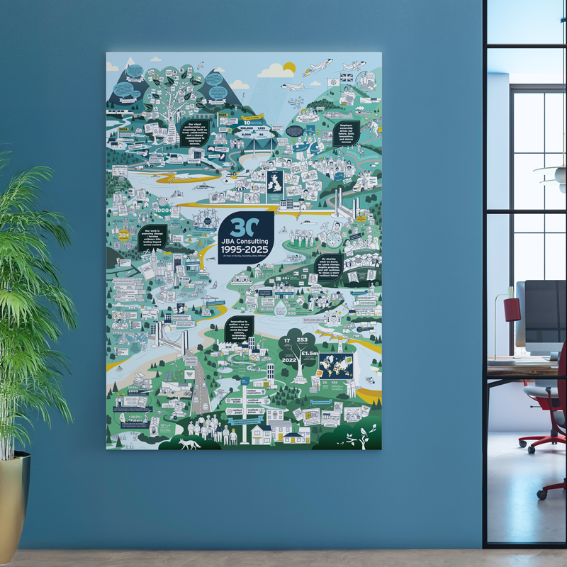
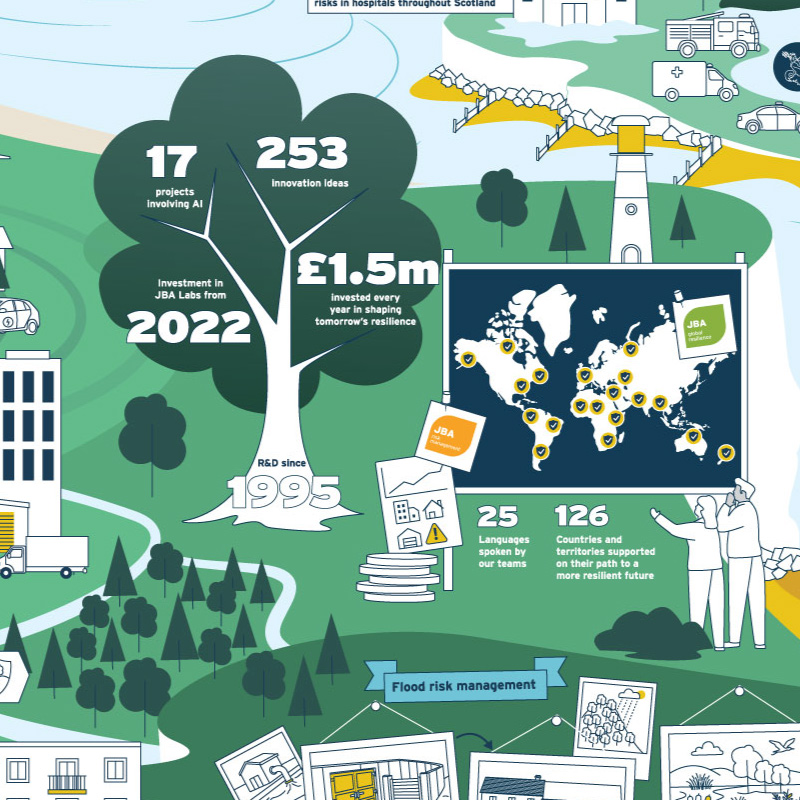
JBA Consulting have spent thirty years working with water. Flood risk, drainage, climate adaptation, coastal resilience and their anniversary needed an illustration that could celebrate all of that.
The brief involved a lot of listening. I sat in on calls with senior members of the team while they talked through the business: how it was structured, how it had grown, what they wanted to say. My job was to take in as much as possible, as fast as possible, and find a way to make it visual.
I developed five different concepts before we agreed on the landscape approach. It let us show JBA’s work in context rather than in isolation. The final piece has five distinct landmasses, each built around one of JBA’s core values, arranged so the connections between them are part of the story. Blues, greens, a pop of yellow. Hidden details, in-jokes, thirty years of achievement packed into a single A0 print displayed across all of their offices, and used in a film they made about the project.
Packaging | Design | Illustration | Consumer Goods | Education | Nature
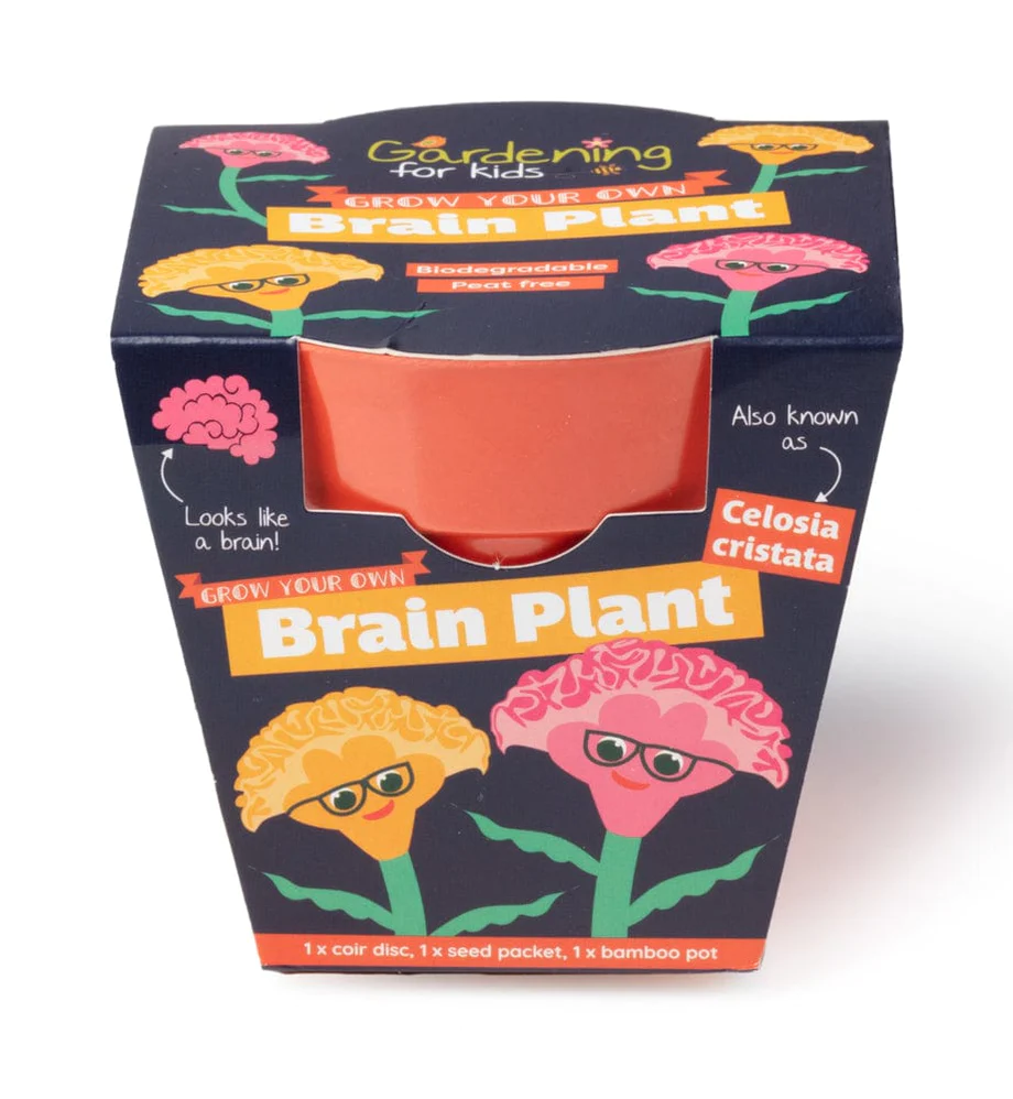
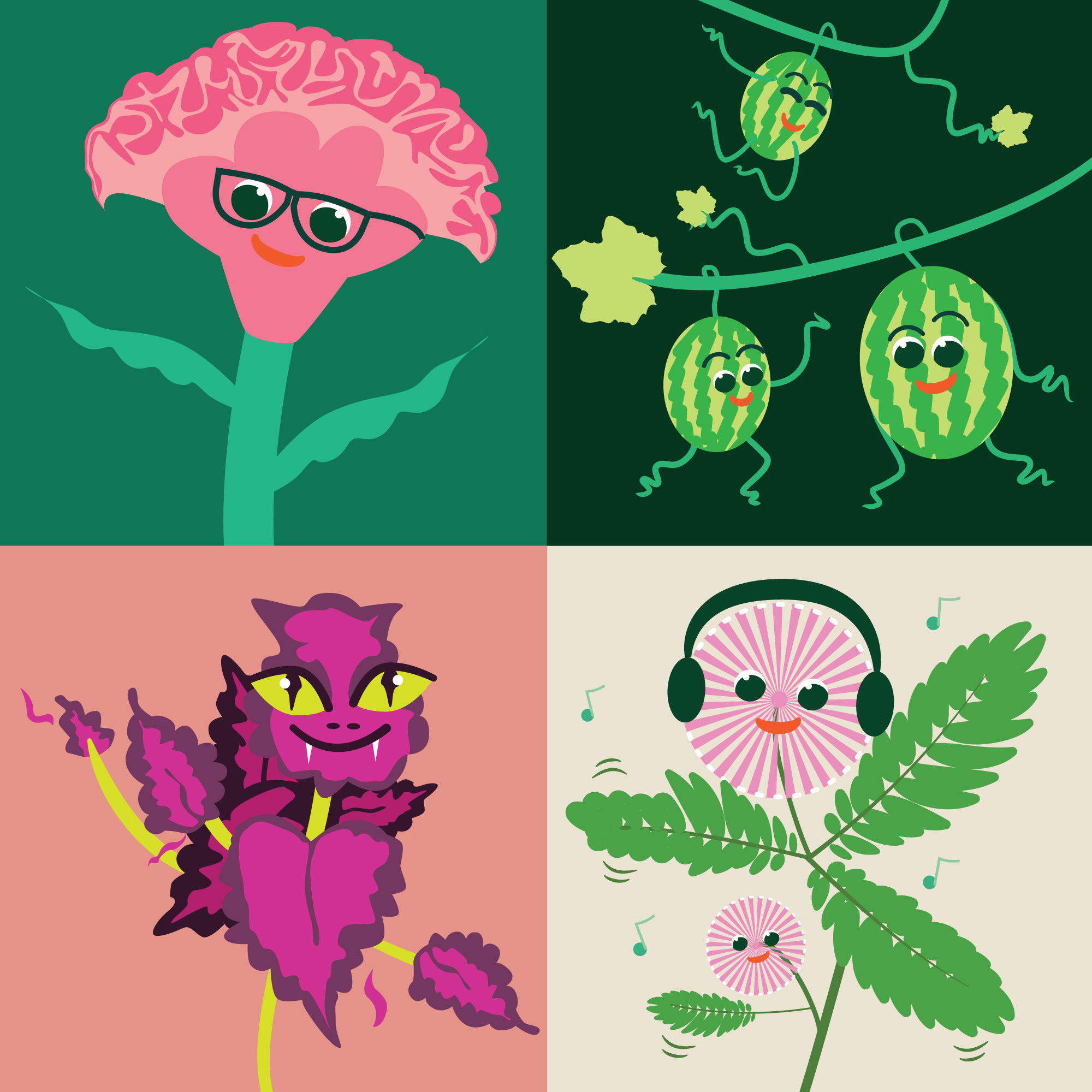
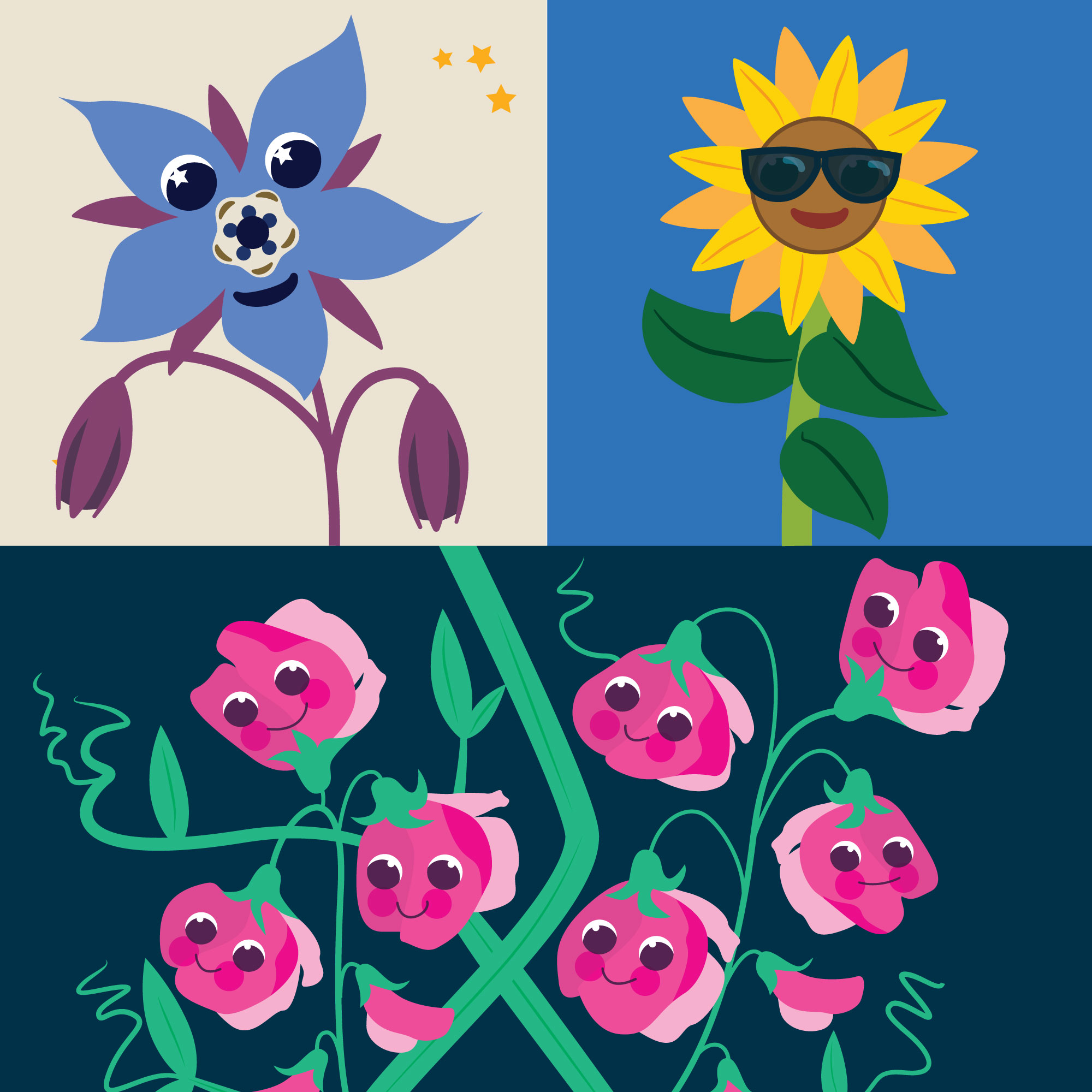
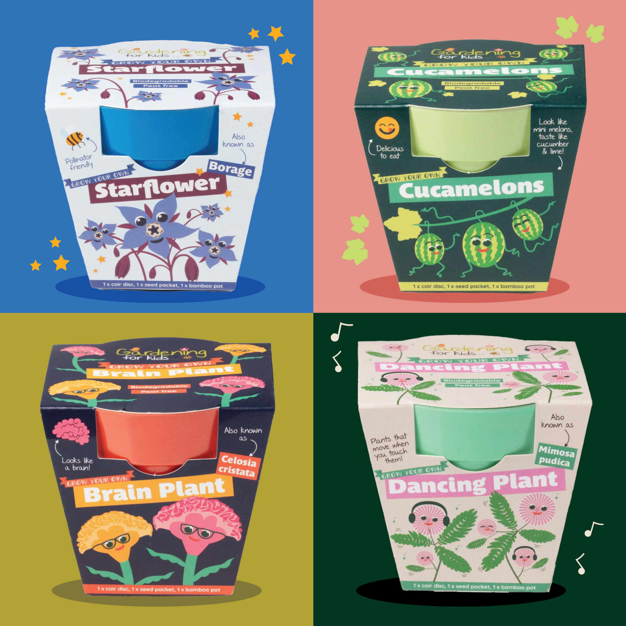
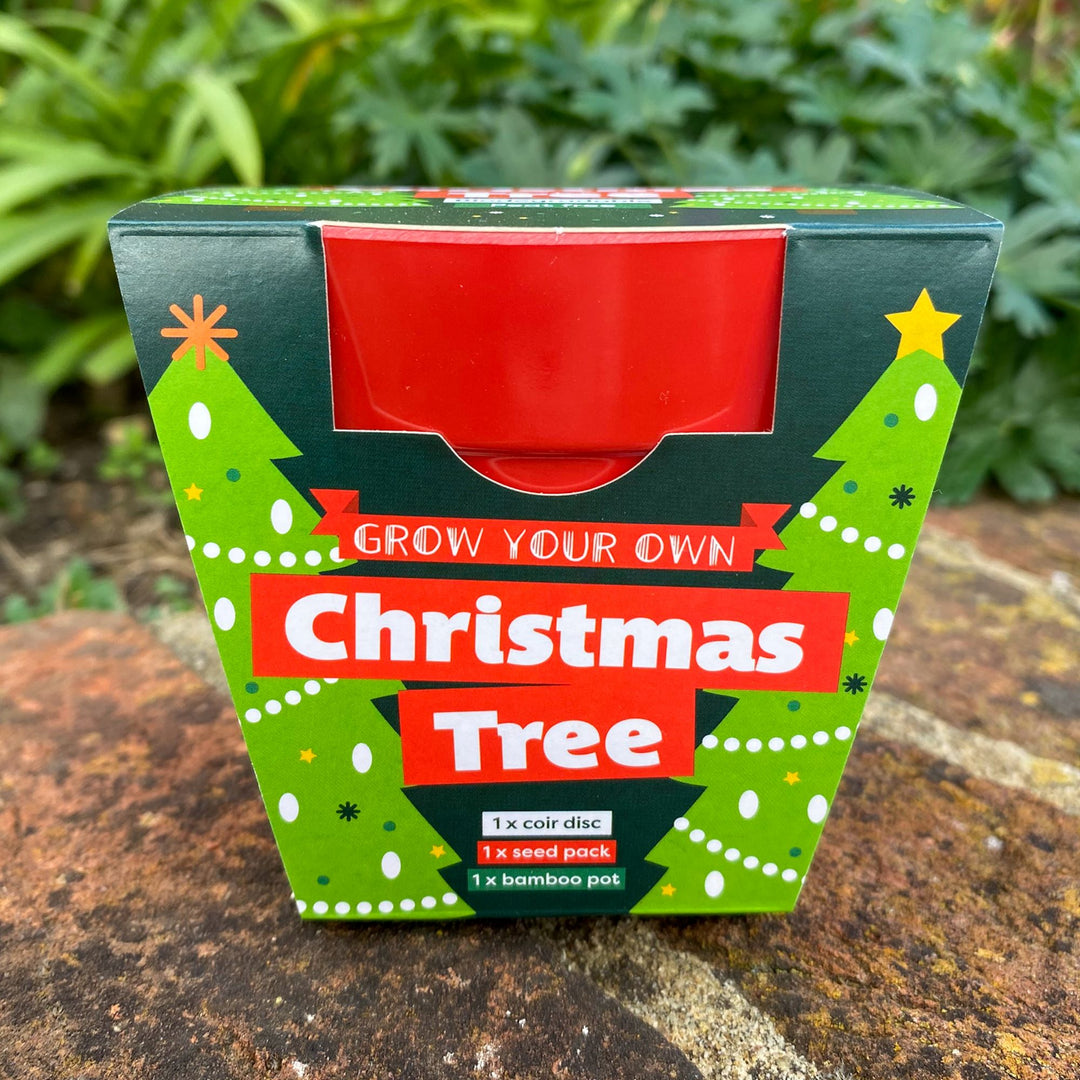
Gardening for Kids Packaging
Gardening for Kids makes grow-your-own kits for children and beginner gardeners. Their packaging had warmth and charm, but wasn’t punching hard enough at shelf level and in a retail environment that matters. They needed something with more personality and stand-out, starting with a Christmas tree kit.
That first pack set the tone for everything that followed. A bold, fun illustration style that could carry shelf presence while still feeling inviting to kids and parents. From there, we rolled the look across their Grow Your Own range, then the Grow Something Different kits – seven packs featuring more unusual plant varieties, each one with its own illustrated character. Just look at those Sweet Peas.
The relationship has grown with the range ever since. A mini greenhouse, Herby Heads (microgreens that grow like hair, yes, really), and whatever comes next. Every new project from them is a different kind of fun!


Brand | Illustration | Charity | Animation | Fundraising
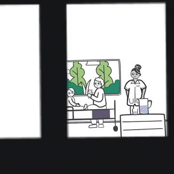
Great Ormond Street Hospital Brand Illustrations
Great Ormond Street Hospital Charity first approached me in 2018 following a brand refresh. They needed a suite of illustrations in keeping with their refreshed identity. Assets that could work across hospital communications, website, social media, and promotional materials, and be used by both the in-house team and their agencies.
That first project grew into a relationship spanning seven years and multiple departments. Over 150 illustrated objects and concepts become a consistent visual thread running through the brand.
Along the way, I contributed to the Build It. Beat It. campaign, GOSH Charity’s most ambitious fundraising appeal in their history, aiming to raise £300 million to build a new world-leading Children’s Cancer Centre. Working with animation studio Broken Antler, I created the storyboards and illustrations for the campaign animation before Broken Antler brought them to life on screen.
Most recently, I created illustrations for their strategy document in 2025.


Design | Branding | Illustration | Education | Charity | Science
Salters’ Institute Science Club Brand & Illustrations
The Salters’ Institute needed a brand, a learning platform UI, and three years of illustration content for Choose Chemistry, their online chemistry club. Rather than managing multiple suppliers across those different disciplines, they worked with me on all of it.
The brand came first, establishing a visual personality and tone designed to inspire 11- to 14-year-olds about chemistry. Alongside this, I developed a gamification concept for the platform and worked with the development team to bring it to life. From there, I created illustrations for 36 monthly themes, covering everything from cosmetics and cooking to metals, minerals and the environment. These illustrations populated the platform, login screens and marketing materials across three years of content.
The platform is still running on that original creative foundation. Last year the team returned to develop new themes, refresh existing ones, and explore how the design could be further optimised for accessibility.


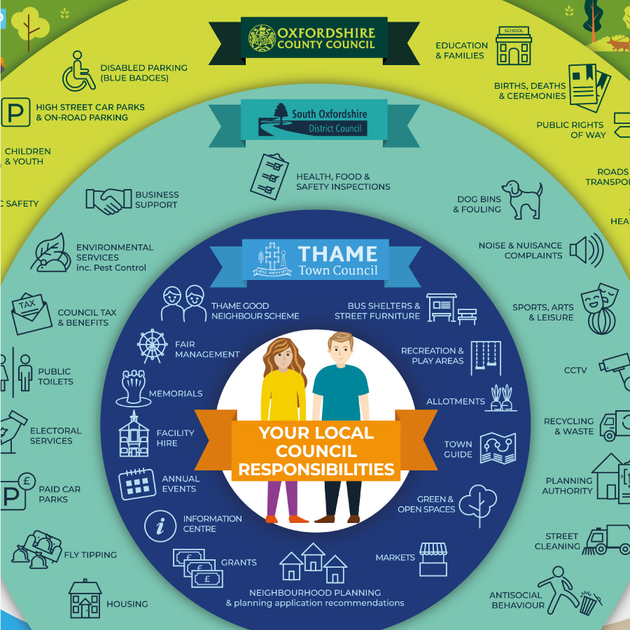
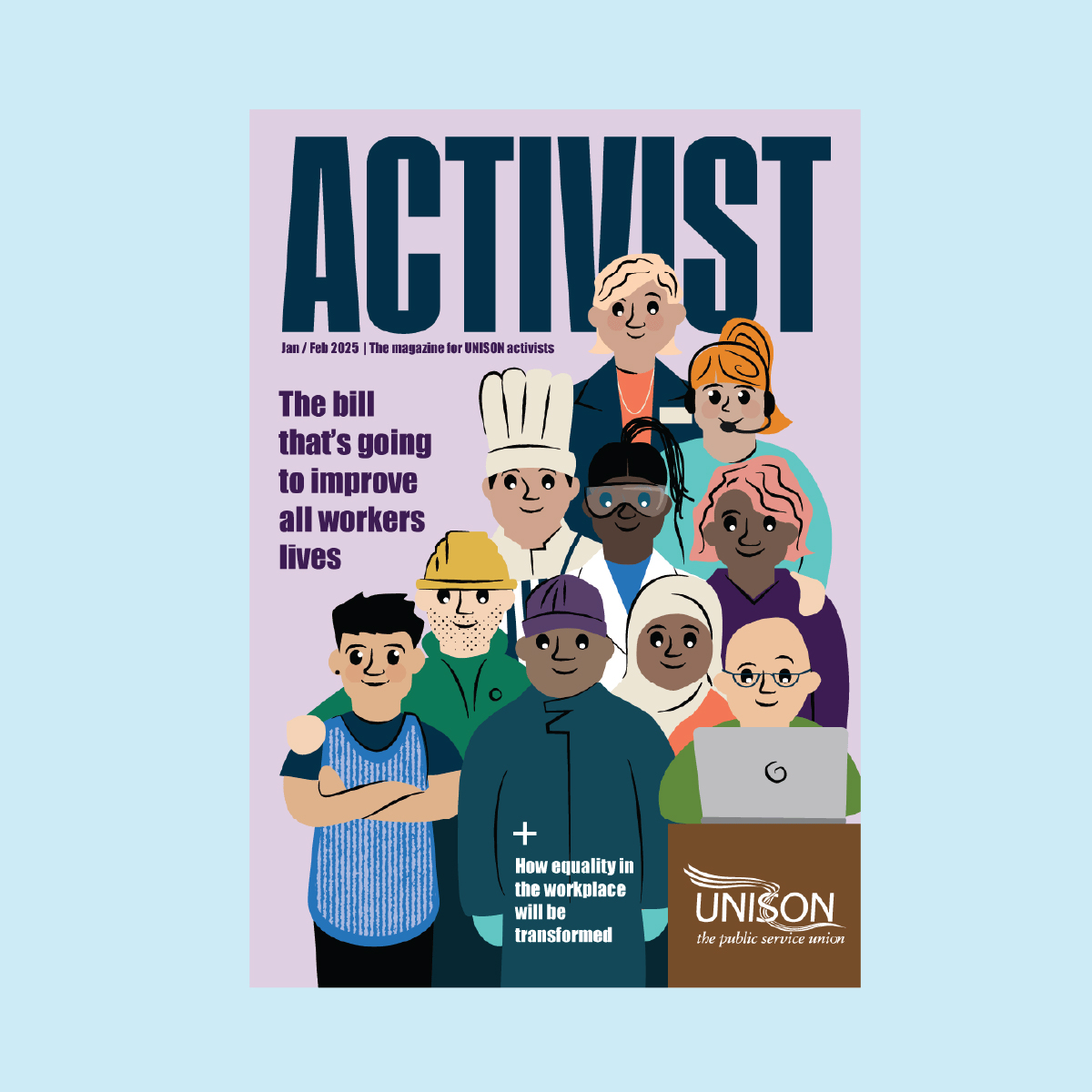
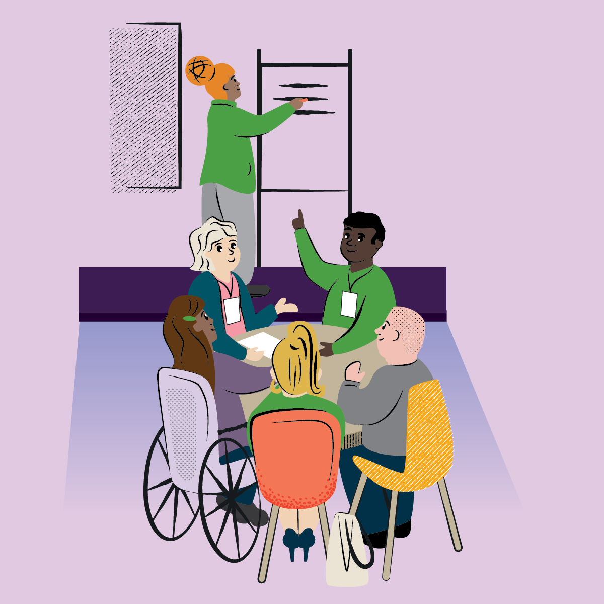
Design | Illustration | Branding | Public Sector | Local Government.
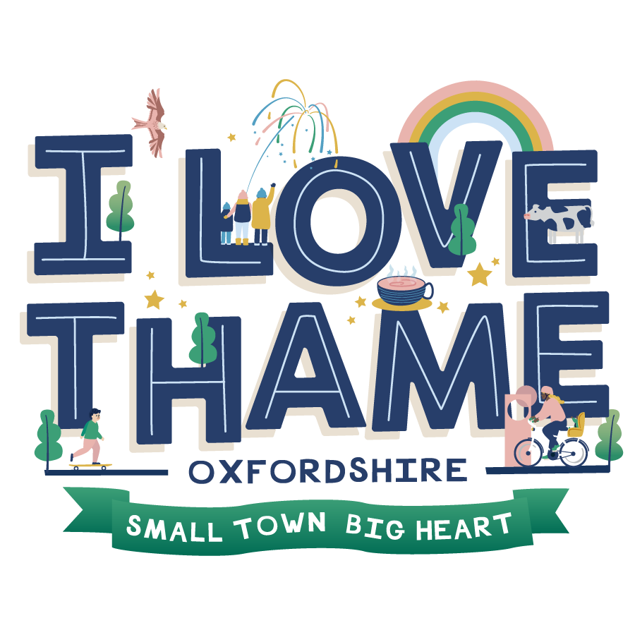
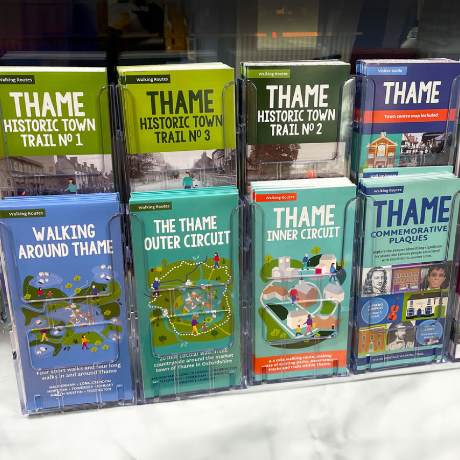
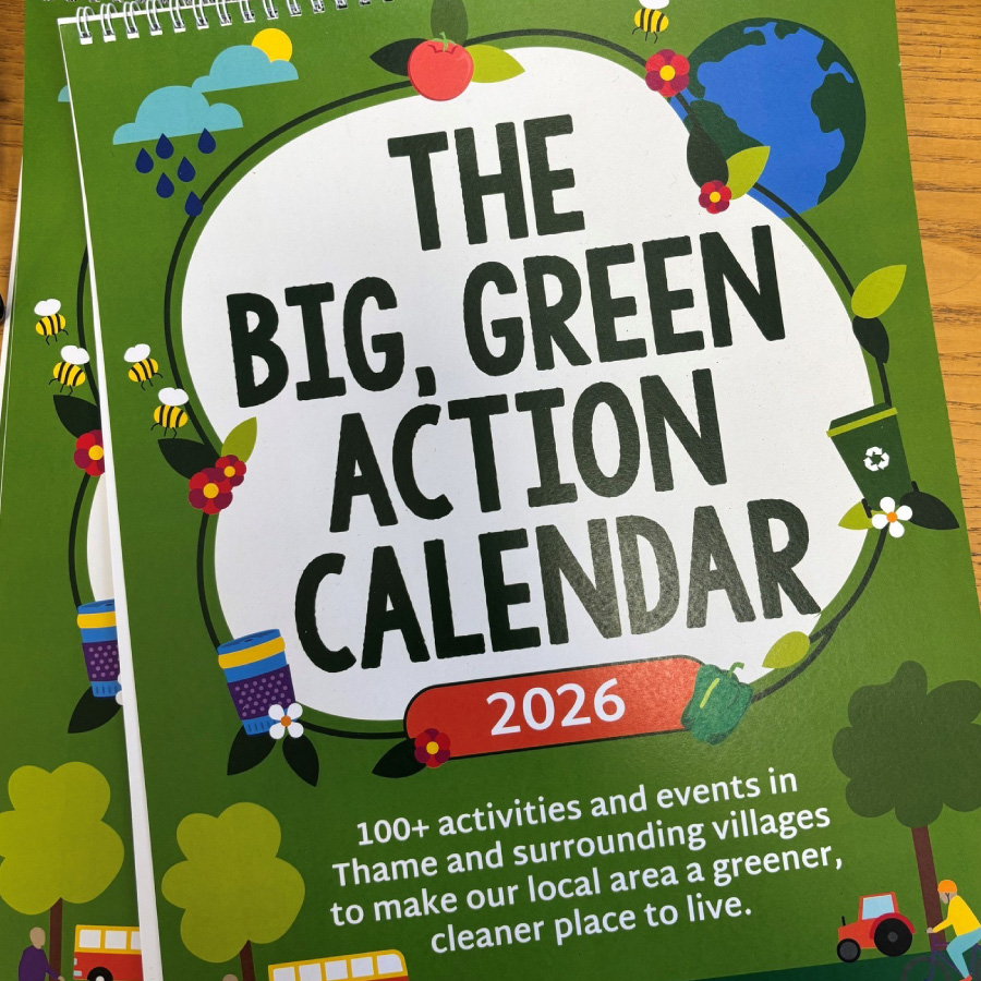
Thame Town Council Design, Illustration & Branding
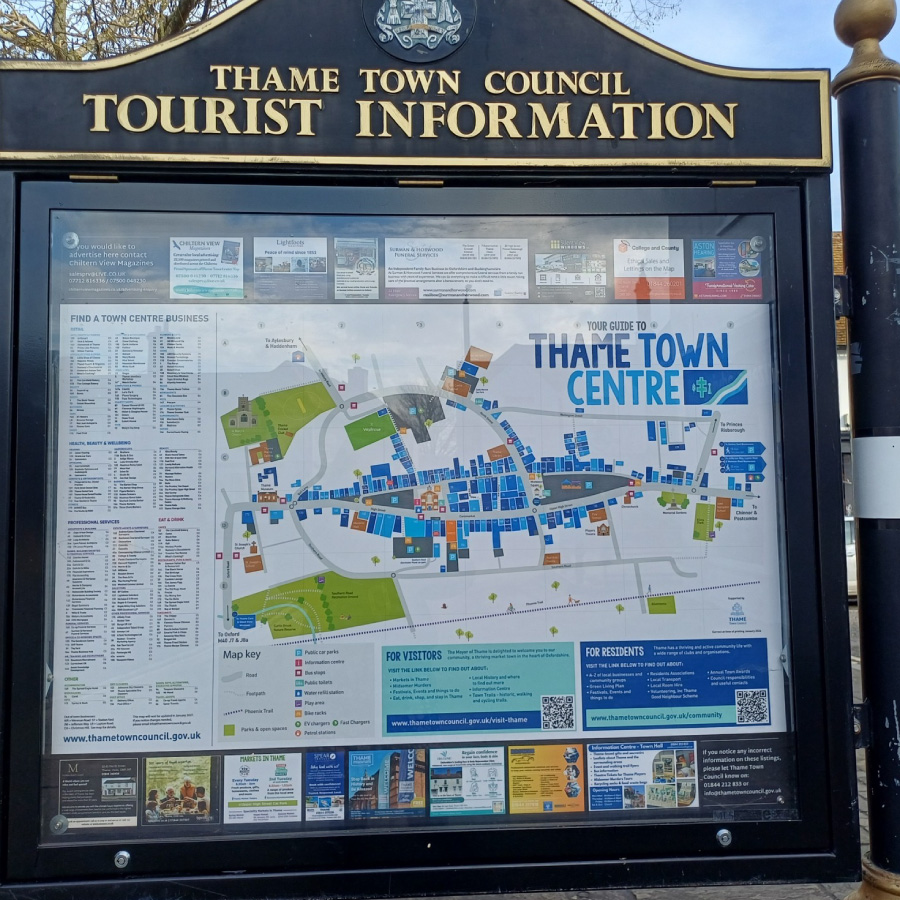
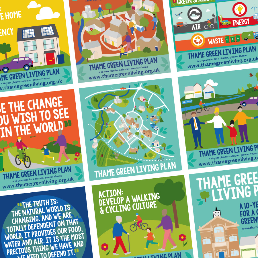
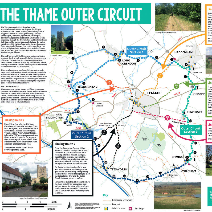
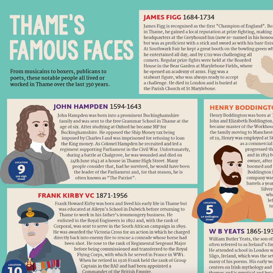
Thame Town Council has been a client since 2014. Over a decade, the work has covered a lot of ground: referendum campaign materials, event branding, town centre wayfinding maps, a Green Living Plan report, merchandise for the town hall shop, an infographic explaining how the tiers of local government work, and a series of eight walking maps covering the town and surrounding villages, from a blue plaques trail to historic town walks.
The range reflects a relationship built over a long time. My contacts at the council and I have been building a visual language for the town for years: colourful, high-energy, rooted in its history as a market town.
Working with local councils suits me. Before going freelance, I worked with councils at every level, including central government, so I understand how they operate, what they need to communicate, and the constraints they’re working within. And it’s extra special when it’s your home town of course!


Brand | Campaign | Illustration | Local Government | Health & Fitness
Active Essex Sport Illustrations
Active Essex, the physical activity partnership for Essex County Council, came to me with a logo, a colour palette, and a clear mission: get Essex moving. What they didn’t have was a visual language to bring that mission to life across everything from websites and strategy reports to banners and T-shirts.
Without an existing illustration style to reference, every early decision carries more weight. So we spent time up front making sure the characters, complexity, and tone were right for an organisation trying to reach everyone in Essex, from competitive cyclists to people taking their first steps into activity.
From that foundation, I built a library of over 75 illustrations – individual characters across a huge range of activities, detailed scenes featuring real locations across the county, and a full illustrated map of Essex. The visual language has proved its worth many times over, with Active Essex returning repeatedly to extend the library across new campaigns and audiences.


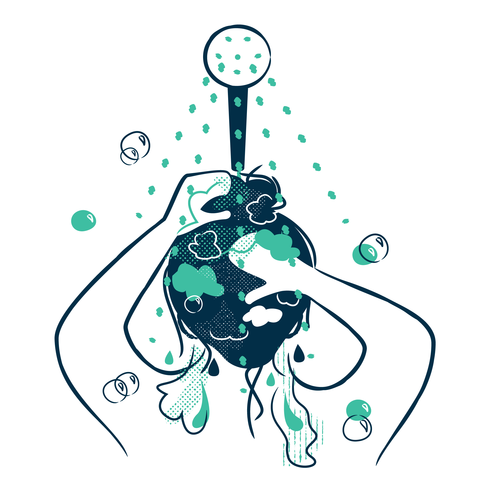
Illustration | Brand | Campaign | Charity
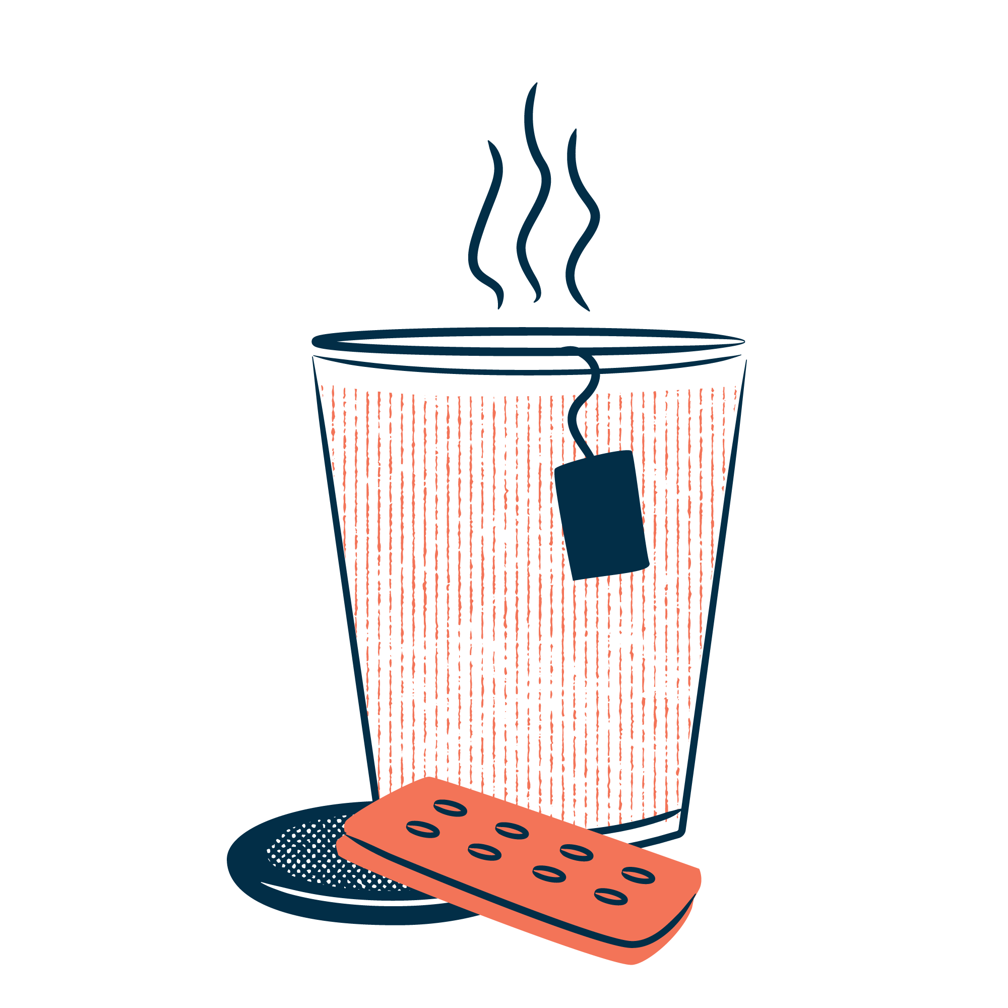
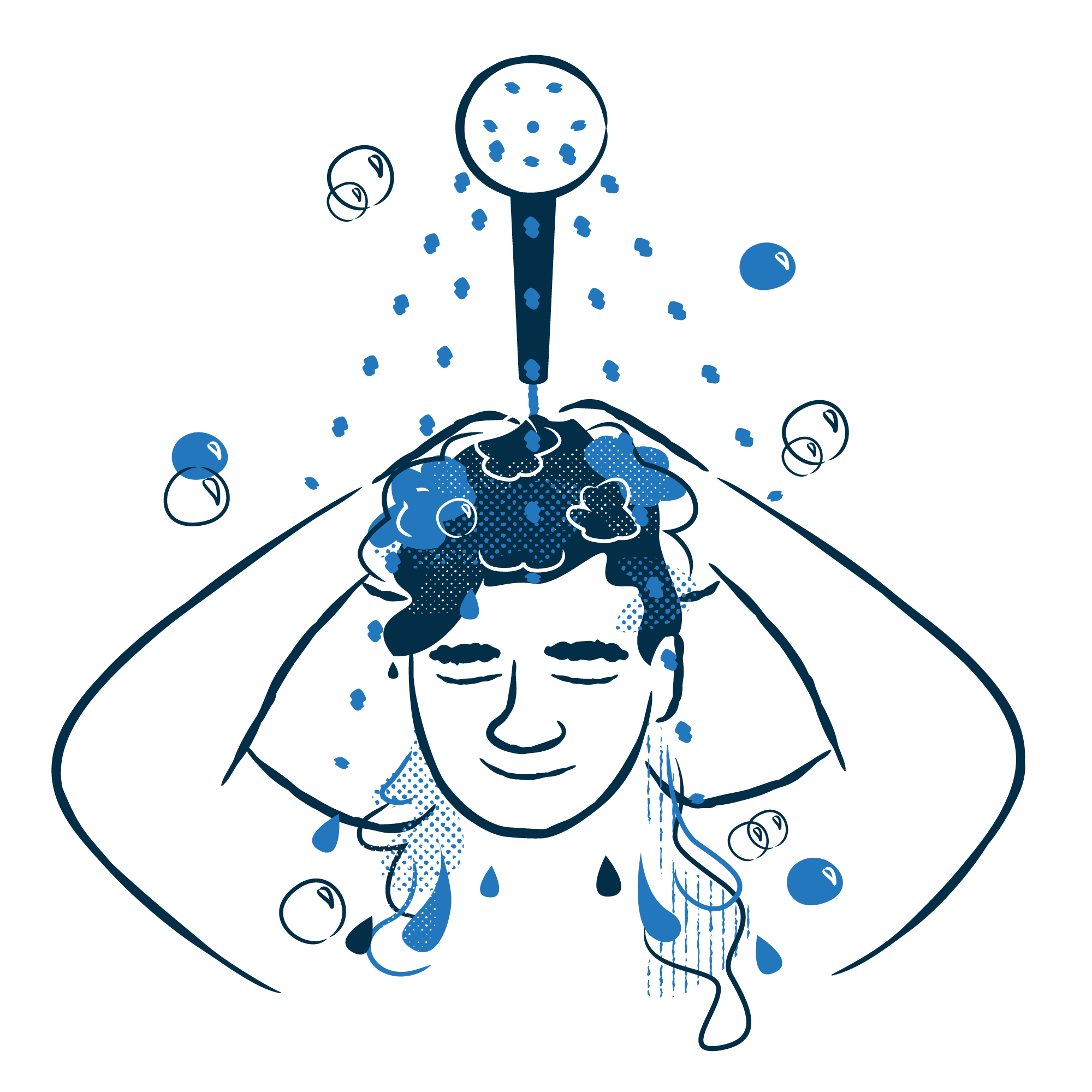
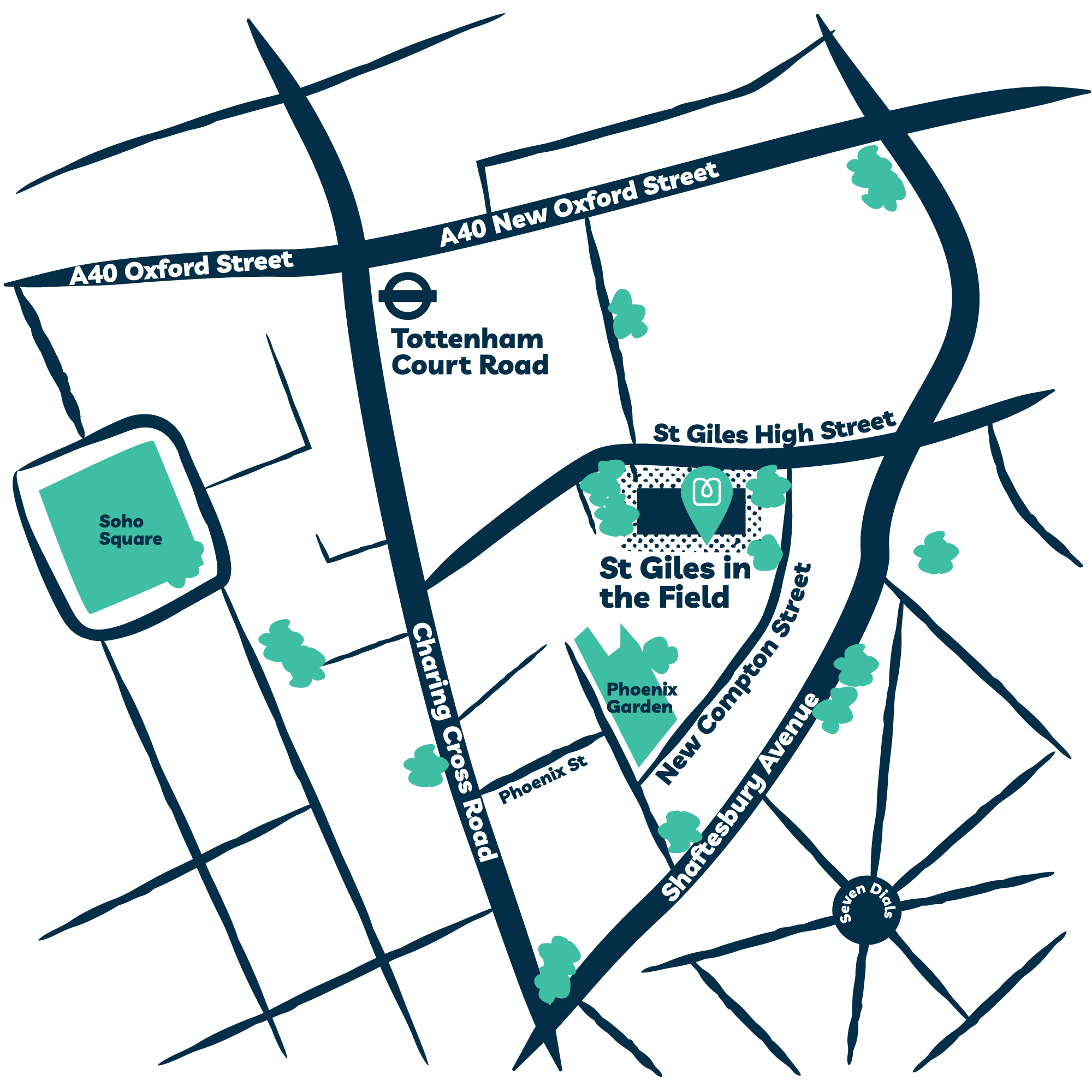
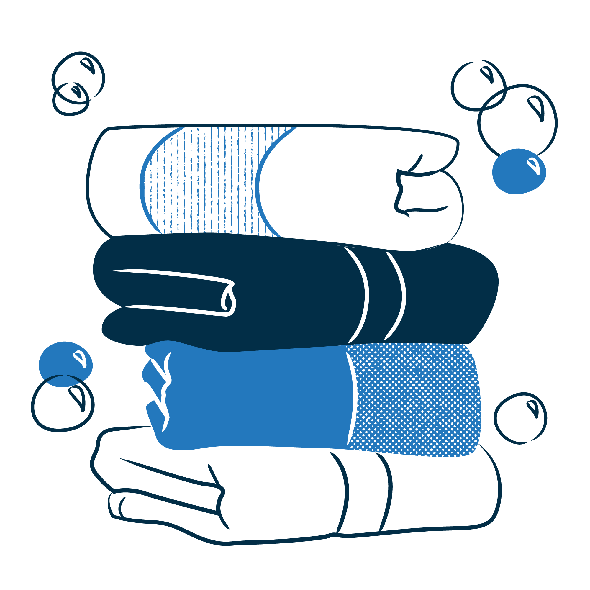
Brand illustrations for ShowerBox
ShowerBox is a charity that provides free, safe shower facilities for people experiencing homelessness. Warm, human communication is central to what they do, but imagery presented a real challenge. Using stock photos wasn’t appropriate, while photographing real service users raised questions about dignity, consent, and safeguarding. Illustration was the right answer.
Starting from their logo and brand palette, we developed a textured line drawing style layered with bold blocks of ShowerBox colours – distinctive, warm and immediately ownable. From that foundation, I created a suite of visual assets: a hero graphic for the homepage, 11 portraits representing the diversity of people who use and support ShowerBox, eight key objects central to their service, and illustrated maps of their three locations.
The result is a flexible set of visuals that can represent the organisation’s story and values honestly, without compromising the people at the heart of it.

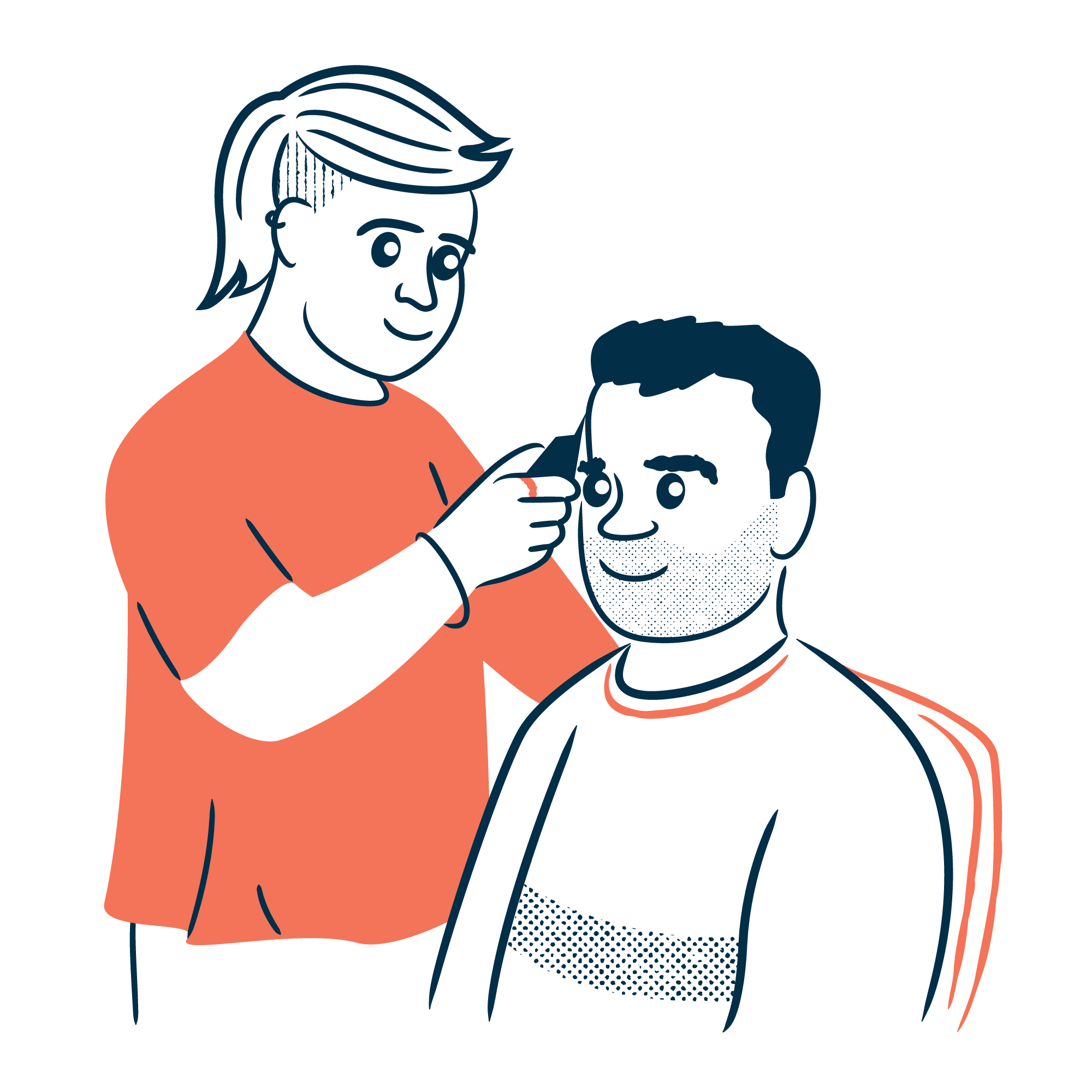
Design | Illustration | Education | Charity | Schools
PSHE Association Schools Resources
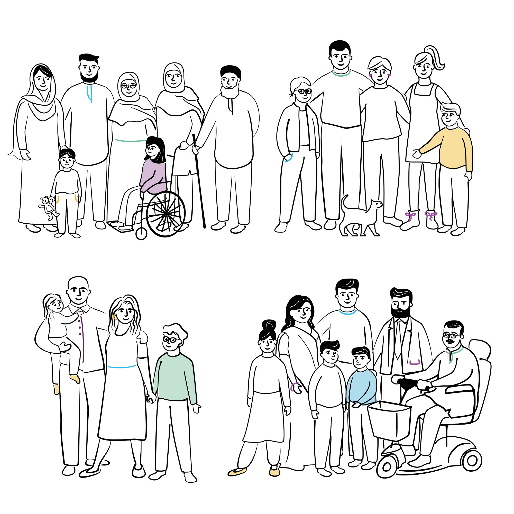
The PSHE Association creates resources helping teachers deliver personal, social, health and economic education across UK schools. They first approached me to create illustrations for drug and alcohol resources aimed at pupils with special educational needs, material that needed to be clear, unambiguous and easy to understand for children who process information differently.
That first project opened the door to a two-year collaboration across some of the most carefully considered briefs I’ve worked on. Illustrated lesson plans and resource packs covering consent, personal identity, bodies and reproduction, online safety, friendship, and a range of family structures. Each one requiring the same clarity and sensitivity.
The most challenging was a joint project with the NSPCC, creating illustrations to help children with learning difficulties understand inappropriate touching and consent. Getting that right, clear enough to communicate without ambiguity, sensitive enough not to cause distress, required a level of care that goes well beyond making things look nice.
I also designed and laid out the teacher resource packs themselves, handling the full production from illustration through to finished document design.


Games & Puzzles | Design | Illustration | Portraits | Charity | Arts & Culture |
Classic FM Composer Portraits and Charity Jigsaw
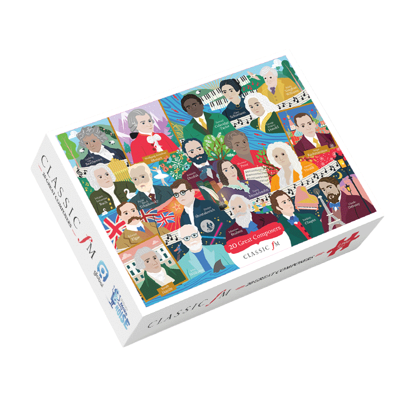
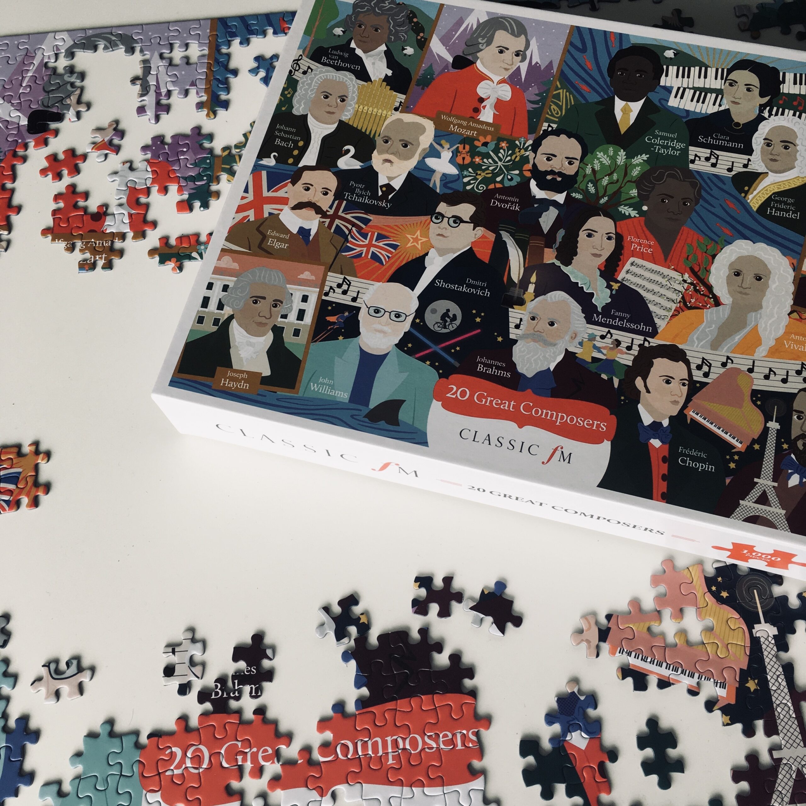
Classic FM’s annual Hall of Fame countdown celebrates the top 300 classical pieces as voted by listeners. They needed a series of illustrated composer portraits to run across their social media throughout the weekend event. 21 portraits in the first year, with a further eight added the following year to reflect the updated list.
The portraits were designed from the start to do two jobs. As standalone images they needed enough personality and presence to hold their own across Classic FM’s feed. But they also needed to work as part of a composite illustration for Global’s Make Some Noise, Classic FM’s charity partner, who wanted to turn the artwork into a 1000-piece jigsaw puzzle to fundraise with.
The puzzle composition grew horizontally as each portrait was completed and signed off, composers slotting into place one by one until the full ensemble came together. The finished piece brings all the composers together with a flowing musical note motif incorporating each name and Classic FM branding. The same artwork extended into a notebook and greeting card set.


And there’s more…


About me
I’m a UK-based designer and illustrator who works with charities, the public sector, educators, and purpose-led businesses. I create thoughtful campaigns, packaging, educational resources, reports, infographics, illustration suites, and more, helping teams communicate, tell their stories, and make a meaningful impact.
Let’s work together
If you’ve got a project that needs clear, human-centred design, illustration, branding or a combo of all three, I’d love to work with you.


